Sexy qua lijf doch bang voor het zwempak
2025/05/24 23:44 Filed in: Digital
Meet Matriks, a clever small monospaced type family specially developed for day-to-day use on screen. Loosely inspired on the 26 capitals of »Quizmaster« (made by Löwen Spielautomaten in 1985) and fueled by my fascination for arcade games.
Meticulously build on a 5×7 matrix: 5 pixels for x-height, 1 px for capitals and ascenders plus 1 px for descenders. By just moving one pixel at a time the Matriks fonts [Dunglish for »Matrix«] took shape. It is astonishing to see how far one can push the contours of the glyphs to sometimes »weird« graphics, but still make us think we’re reading Roman characters!
Matriks is designed in a series of grades: Regular, Bold and Black. The fonts are build on the same matrix but offer different degrees of darkness on the screen. Unlike the weights of most type families—which grow progressively wider as they get bolder—Matriks grades in color without affecting copy fit.
With more than 200 glyphs each font contains a full Google Fonts Basic character set.
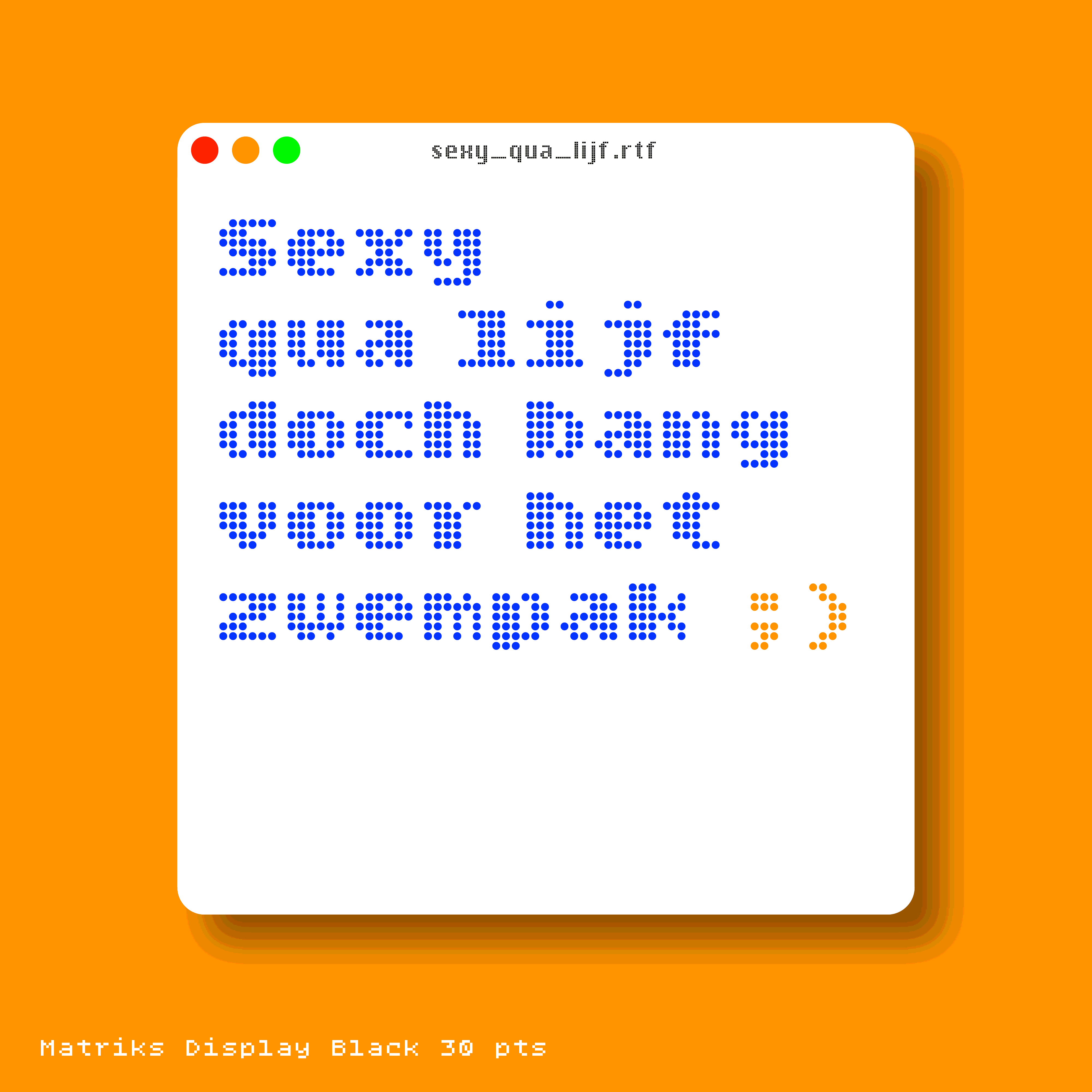
Matriks Display Black is based on the most extreme weight of the family, has more detail, is tighter spaced and works very well in large sizes. In summer 2024 a new family member was born: Matriks Kompakt. Use it when (precious) space is scarce.
Design is an iterative process: explore, try, share, test, reject… and again. More iterations = better solutions. An early version of Matriks was named »SquarePants«. Guess who inspired me then…
Time to play! For just 90 EUR you purchase a license for the entire family: Display Black, Display Regular, Regular, Bold, Black and Kompakt. If you like to purchase a single cut only (for instance Matriks Display Black), no problem. Just send an email to designisfijn@icloud.com. Order your copies… now!
Download a type specimen in PDF format.