Digital
Sexy qua lijf doch bang voor het zwempak
2025/05/24 23:44
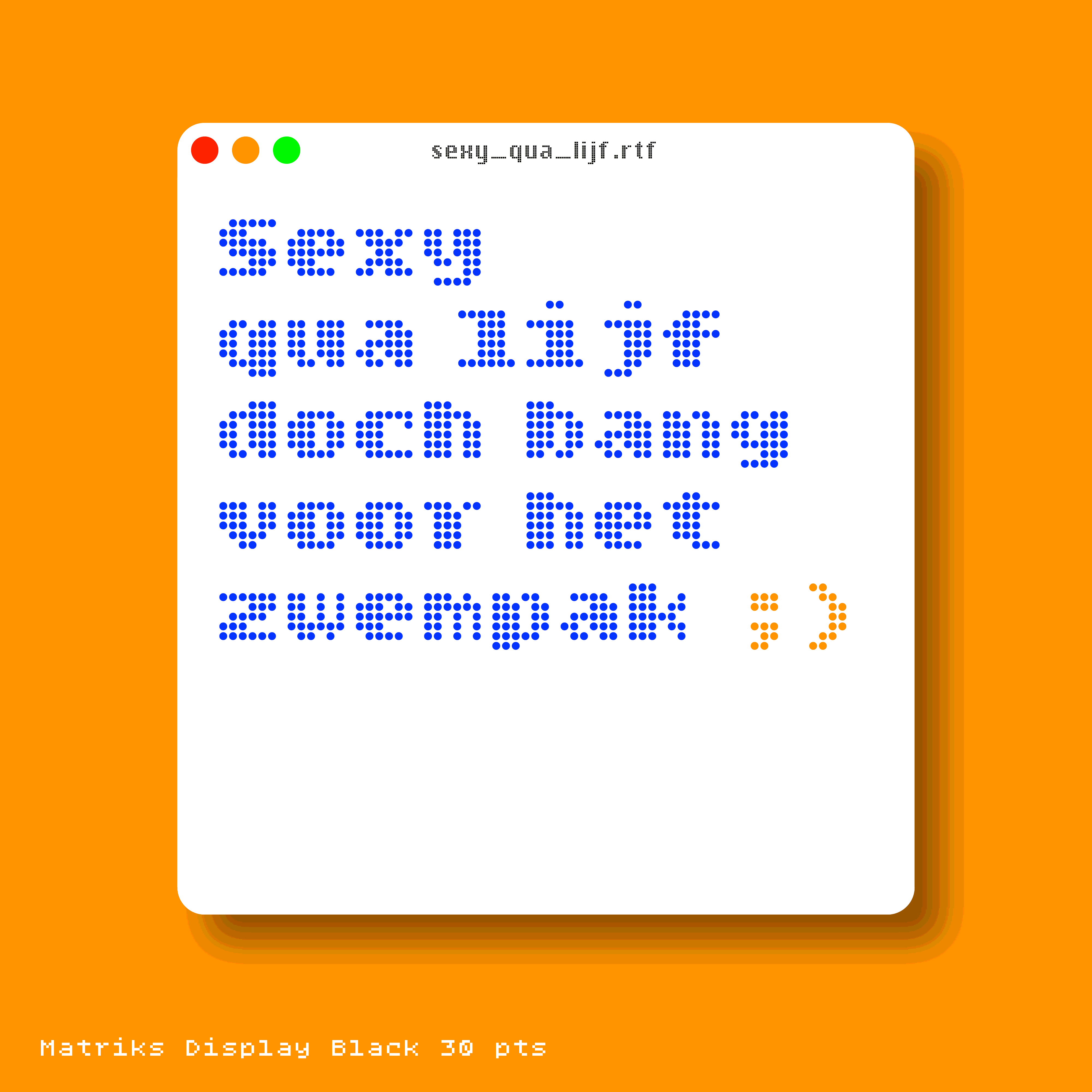
Meet Matriks, a clever small monospaced type family specially developed for day-to-day use on screen. Loosely inspired on the 26 capitals of »Quizmaster« (made by Löwen Spielautomaten in 1985) and fueled by my fascination for arcade games.
Meticulously build on a 5×7 matrix: 5 pixels for x-height, 1 px for capitals and ascenders plus 1 px for descenders. By just moving one pixel at a time the Matriks fonts [Dunglish for »Matrix«] took shape. It is astonishing to see how far one can push the contours of the glyphs to sometimes »weird« graphics, but still make us think we’re reading Roman characters!
Matriks is designed in a series of grades: Regular, Bold and Black. The fonts are build on the same matrix but offer different degrees of darkness on the screen. Unlike the weights of most type families—which grow progressively wider as they get bolder—Matriks grades in color without affecting copy fit.
With more than 200 glyphs each font contains a full Google Fonts Basic character set.
Matriks Display Black is based on the most extreme weight of the family, has more detail, is tighter spaced and works very well in large sizes. In summer 2024 a new family member was born: Matriks Kompakt. Use it when (precious) space is scarce.
Design is an iterative process: explore, try, share, test, reject… and again. More iterations = better solutions. An early version of Matriks was named »SquarePants«. Guess who inspired me then…
Time to play! For just 90 EUR you purchase a license for the entire family: Display Black, Display Regular, Regular, Bold, Black and Kompakt. If you like to purchase a single cut only (for instance Matriks Display Black), no problem. Just send an email to designisfijn@icloud.com. Order your copies… now!
Download a type specimen in PDF format.
»Vechtstreek is gonna wreck it!«
2025/05/24 23:44

Vechtstreek is a ttribute to typeface Chicago by Susan Kare, an American artist and graphic designer who contributed interface elements and typefaces for the first Apple Macintosh personal computer (1983).
Vechtstreek is a true vector-based font with more than 180 glyphs* pure nostalgia! Use it in your every-day-apps like TextEditor, Notes and Mail or make a pixelated impression with Adobe’s Creative Suite.
An early version of Vechtstreek goes back to 2018 when Walt Disney’s movie »Ralph Breaks the Internet« displayed a Chicago spin-off in various scenes and made me wonder »Can I do that?!«
If your project requires that retro bitmap look-and-feel Vechtstreek is gonna wreck it! Or in typical Dutch: Vechtstreek gaat het rammen!
* Uppercase, lowercase, standard punctuation, accented uppercase, accented lowercase, arrows, &cetera.
Download a type specimen in PDF format.
RTFM
2025/05/24 23:44
In 1984 Susan Kare worked on the first version of Apple’s revolutionary graphical user interface. She began by sketching arrows, buttons, pointing hands, and other visual elements in a notebook. These casual prototypes of the new, user-friendly face of computing were initially drawn with a pen on graph paper, each square representing a pixel.
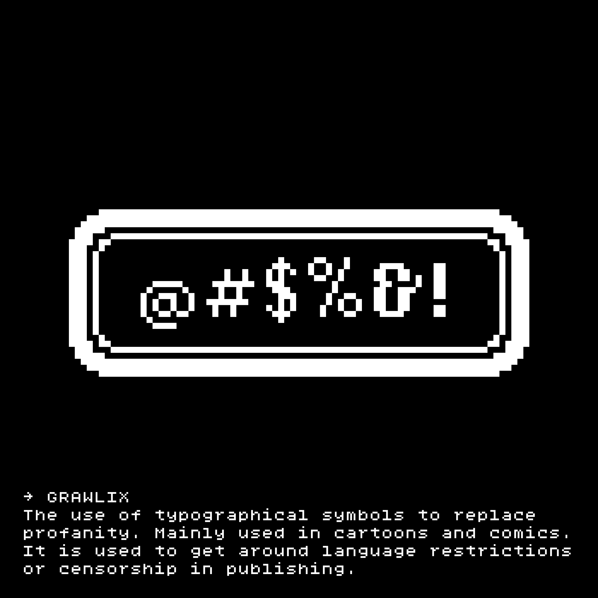
For long I am fascinated by internet slang and ASCII emoji which unstoppably infiltrated our digital communication. These sequences worked as a short code in several forums and chatrooms. RTFM (yes, Read The Fucking Manual) combines both worlds. Use it to quickly generate custom UI buttons. Instant fun for T-shirts or social media stickers! (Try Sticker Maker.app, it’s free)
RTFM works on macOS plus Windows computers and with a few extra steps (try iFont.app, not free) on your Apple mobile devices as well.
Is RTFM free? Nope. But for just 10 EUR you can add RTFM (+ bonus font RTFM Sticker and an Adobe Illustrator template to generate your first buttons / stickers) to your font collection. Just send an email to: designisfijn@icloud.com.
RTFM will be updated regularly with more iconic, pixelated design elements from the previous century. Stay tuned in and follow me on Insta!
Download a type specimen in PDF format.
“Dag, lieve kijkbuiskinderen”
2025/03/23 18:13
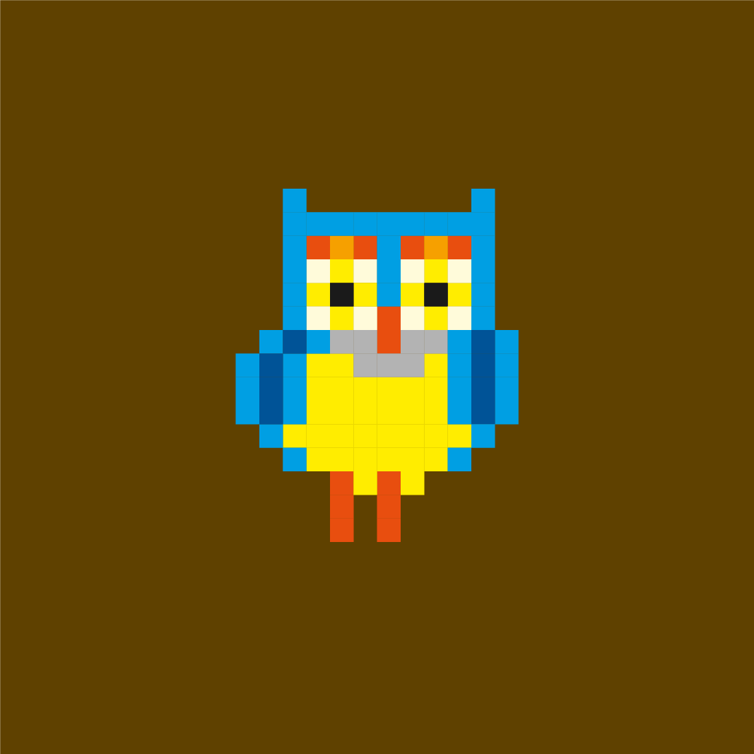
Meneer de Uil is a character in the popular Dutch television series ‘De Fabeltjeskrant’. He is a somewhat long-winded and forgetful owl who often interrupts his sentences with “Eh…” and ends with “Jawel!”. Well-known sayings: “Dag, lieve kijkbuiskinderen” and “Oogjes dicht en snaveltjes toe”. In 2022, this permanent farewell greeting was included in the Dutch Dikke Van Dale [dictionary].
I’ve drawn this pixel character for my family social media group [named ‘From the archive’] and as an icon for my digital archive [extended hard disk].
“Hulk SMASH!“
2024/05/12 17:16
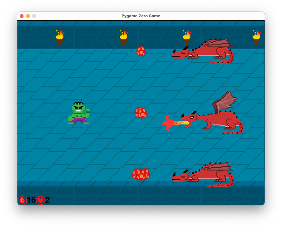
In this game, the player controls the Incredible Hulk through the four arrow keys. He must get 20 eggs from the dragon’s lair to win. Each dragon sleeps, but wakes up at different times. If the Hulk is near an awake dragon, he loses a life. The game ends when the player runs out of lives or collects enough eggs. This simple game is written in Python to sharpen my programming skills.